
下面献上我的代码,为了以后更加熟练掌握和熟练运用css,在这里做上一个笔记。

<!DOCTYPE html>
<html>
    <head>
        <meta charset="UTF-8">
        <title>图片旋转</title>
        <style type="text/css">
            div{ width: 300px; height: 240px; margin:200px auto; animation: rolldiv 10s linear infinite; transform-style: preserve-3d;
            } @keyframes rolldiv{ from{
                    transform: rotateY(0deg);
                } to{ transform: rotateY(360deg);
                } }

            img{ width: 300px; height: 240px; opacity: 0.9; position: absolute;
            } img:nth-child(1){ transform: rotateY(36deg) translateZ(500px);
            } img:nth-child(2){ transform: rotateY(72deg) translateZ(500px);
            } img:nth-child(3){ transform: rotateY(108deg) translateZ(500px);
            } img:nth-child(4){ transform: rotateY(144deg) translateZ(500px);
            } img:nth-child(5){ transform: rotateY(180deg) translateZ(500px);
            } img:nth-child(6){ transform: rotateY(216deg) translateZ(500px);
            } img:nth-child(7){ transform: rotateY(252deg) translateZ(500px);
            } img:nth-child(8){ transform: rotateY(288deg) translateZ(500px);
            } img:nth-child(9){ transform: rotateY(324deg) translateZ(500px);
            } img:nth-child(10){ transform: rotateY(360deg) translateZ(500px);
            } body{ transform-style: preserve-3d; -moz-perspective: 2000px;
            } </style>
    </head>
    <body>
        <div>
            <img src="img/pic1.jpg" />
            <img src="img/pic2.jpg" />
            <img src="img/pic3.jpg" />
            <img src="img/pic4.jpg" />
            <img src="img/pic5.jpg" />
            <img src="img/pic6.jpg" />
            <img src="img/pic7.jpg" />
            <img src="img/pic8.jpg" />
            <img src="img/pic9.jpg" />
            <img src="img/pic10.jpg" />
        </div>
    </body>
</html>
这个是在 Hbuilder 里面写的代码,效果不错。
逐一分析css的属性:
margin:与上面的边框的相隔的像素值,与左边相离像素值。
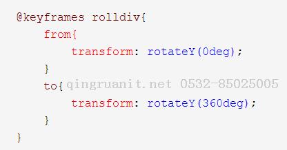
from {} to {} 这个表示从0°旋转到360°。
@keyframes rolldiv :这个是对动画进行定义,其中rolldiv是这个动画的名称,方便在后文中进行引用。
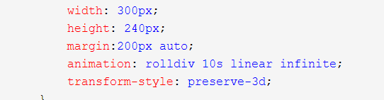 在这里面的animation里面便进行了引用,10s表示它整个动画维持的时间总和,linear infinite 这个则是表示它运行无限次,当然你也可以规定次数,比如3,就表示三次。
下面这个transform-style则表示它这个是3d的效果。
opacity表示它的透明度,最上方的照片我定义的为0.9。这个属性值的范围是0~1,从全透明变成不透明。
position 表示位置。
在下面来的就是这个我第一次见到的属性了!

因为我总共10张图片,然后需要旋转360°,于是每张图片旋转为36°,后面的translateZ(500px),表示距离旋转中心Z轴500个像素。
而前面的nth-child(1~10)表示每一张子图片。
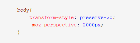
style这个表示它是3d的效果。,后面这个perspective我的测试效果是,值越大,整体就越矮。
综述,这里面的图片也可以转换为video,加上js代码便可以实现鼠标置上时,播放视频等效果。过程也是比较简单的。
接下来,关于旋转,这里列举时钟的例子:
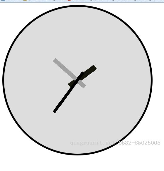
首先,不得不说,颜色搭配得不太美观,但是没关系,你可以自己尝试搭配你喜欢的颜色。
代码展示:
<!DOCTYPE html>
<html>
    <head>
        <meta charset="UTF-8">
        <title>时钟</title>
        <style type="text/css">
            .yuan{ width: 500px; height: 500px; background-color: #ddd; border-radius: 50%; border: 6px solid #000000; position: relative;
            } .miaozhen{ width: 10px; height: 170px; background-color: #000000; position: absolute; left: 245px; top: 114px; animation: animationmiaozhen 60s; animation-iteration-count: infinite; transform-origin:50% 80%;
            } .fenzhen{ width: 14px; height: 140px; background-color: #A2A2A2; position: absolute; left: 243px; top: 144px; animation: animationfenzhen 3600s; animation-iteration-count: infinite; transform-origin:50% 76%;
            } .shizhen{ width: 18px; height: 110px; background-color: #16160D; position: absolute; left: 241px; top: 174px; animation: animationshizhen 43200s; animation-iteration-count: infinite; transform-origin:50% 69%;
            } @keyframes animationmiaozhen{ from{
                    transform: rotate(0deg);
                } to{ transform: rotate(360deg);
                } }
            @keyframes animationfenzhen{ from{
                    transform: rotate(0deg);
                } to{ transform: rotate(360deg);
                } }
            @keyframes animationshizhen{ from{
                    transform: rotate(0deg);
                } to{ transform: rotate(360deg);
                } }
        </style>
    </head>
    <body>
        <div class="yuan">
            <div class="shizhen">

            </div>
            <div class="fenzhen">

            </div>
            <div class="miaozhen">

            </div>
        </div>


    </body>
</html>
代码看起来也比较容易写,难度也不算很大。
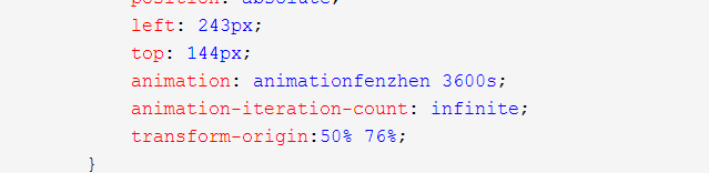
left——>左间距,top——>上间距。
animation:动画定义后的实现及完成时间。
animation-iteration-count:次数,这里是无限次。
transform-origin:这里表示旋转中心点分别在width和height的所占比例,由于,我在追求美观,希望针尾长度一致,所以这里的比例便不同。需要编程人员自己计算,so easy!
然后结合上面提到的旋转木马,其实这个就很容易理解了。
心向旋转巧得木马 峰回路转偶得时钟 希望总有一款可以让我们更加了解css!
更多精彩分享
- 陆老师 [海军工程大学 硕士 — 嵌入式开发专家] 2024-03-26 11:26:03.003
- 时光飞逝 2024-03-26 11:25:53.823
- 纸上得来终觉浅 2024-03-26 11:25:42.68
- 软件行业发展七大方向 2024-03-26 11:25:34.457
- 如何组建测试团队? 2024-03-26 11:25:25.33
- 在青岛学习JavaEE哪家学校最好? 2024-03-26 11:25:16.78
- 教务排课系统 2024-03-26 11:24:56.74
- 青岛帕特智能科技有限公司 2024-03-26 11:24:30.433
- 消息队列NetMQ 原理分析4-Socket、Session、Option和Pipe 2024-03-26 11:24:15.657
- 感谢,我亲爱的万码学堂 2024-03-26 11:12:06.6
![陆老师 [海军工程大学 硕士 — 嵌入式开发专家]-Java培训机构,青岛Java培训,青岛计算机培训,软件编程培训,seo优化培训,网络推广培训,网络营销培训,SEM培训,网络优化,在线营销培训,Java培训](/uploadImages/20200701/1593572111851010992.jpg) 陆老师 [海军工程大学 硕士 — 嵌入式开发专家]
陆老师 [海军工程大学 硕士 — 嵌入式开发专家]